
Too much brown?
- Leslie Martin
- Dec 11, 2024
- 3 min read

Maybe I just don’t like brown. I’m almost done with my first big piece out of this collection and I don’t like it all that much. So I’ve been staring at it, trying to figure out what I don’t like about it. It’s not the values, when I desaturate a picture of it they are spot on. Application-wise, I like the way I’ve constructed the piece. I like the layering. I’m still trying to figure out how to analyze composition, but I feel pretty good about this one. My eye is drawn over to the light on the right side of the painting and then pulled back by the building and the figure. It moves back and forth quite nicely. So what is wrong?
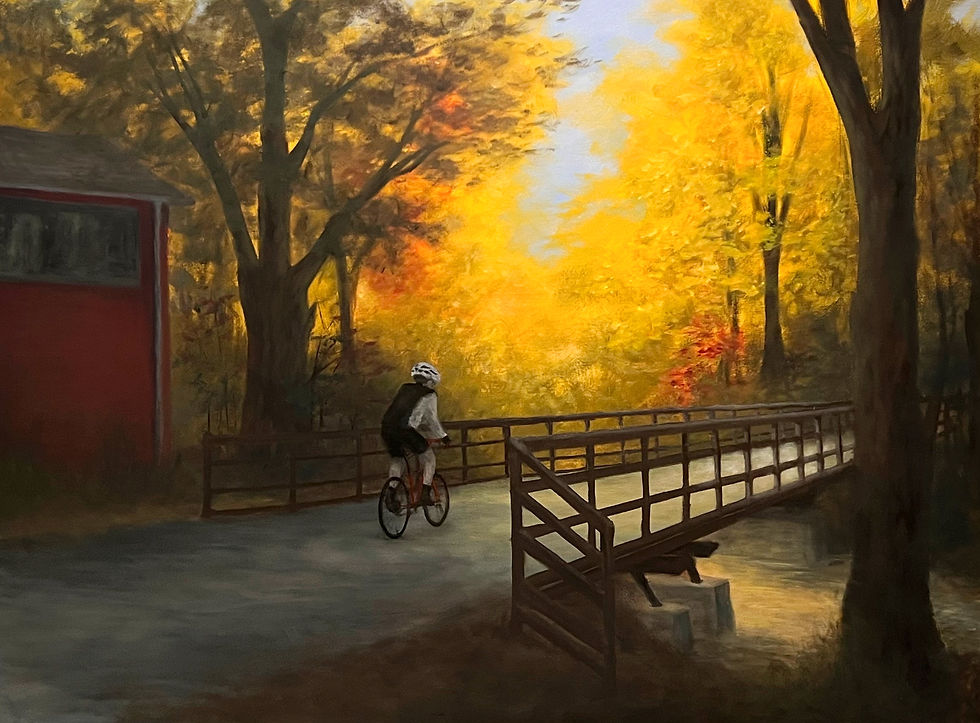
To be honest, it feels old. When I look at it, it feels out of date. And not in a nostalgic way. I wanted the colors to just scream fall, but somehow they scream 1970s instead, like it's a brown, gold, and orange couch.
In my initial journaling for the fall series, I wanted to emphasize cold shadows and crisp air. I don’t think I made it with these. The whole thing is too warm. I think the yellow underpainting, while very helpful to the glow of the trees, is acting against the blue sky and cool shadows. The questions now are
1) Can I fix this?
2) Will this fix my dislike of the piece?
Let’s find out…

Well, the answers to both of those questions are "sort of."
I started by mixing a thin glaze of ultramarine blue with a touch of alizarin crimson. I put it over the shadowed portions and right away I could see the difference. It created a lovely opposition to the lighted section. Unfortunately, this doesn't translate well to the photographs. Apparently I have more to learn about taking quality images of paintings.
In addition, I added graffiti to the building, increased the shadow under the roofline, and added some leaf litter to the edges of the trail on the left side of the painting.
At this point I was feeling better about everything but the cyclists. He still looked flat. So I studied my reference photo compared to the painting and worked to adjust some values. I also realized that my guy was more in profile than the reference photo and I needed to make changes to his legs to reflect this. That was tricky. I had to visualize what a leg would look like from the side rather than from the back. But I managed to make that turn. I also highlighted his shirt and back. Suddenly the little guy had more life in him and sat in the picture rather than on the picture. Although I don’t think he is the greatest depiction of a cyclist and if I had to do it again there are things I would change, I’m still proud of what I’ve made. I haven’t painted a figure in over a decade, so I feel like this is a win for me.
Overall this painting still falls short of what I want it to be. But I'm going to think of that as a good thing. It means I have more growing to do. I'm going to leave it as is. Then, in a few months, I'll revisit it and see what I can learn about what to do or not do in the future.


Comments